

Hello, it’s Kristy Malone, at Refining Design Inc.
This is for all you gentlemen out there, who want to modernize your man cave, and want to be saved, and given direction, as to how you can do that, and make your space more contemporary, and in the now, as opposed to in the past.
I want to continue my segment from last week, about the color black, and how it can be a grounding factor, in any space.
You have to be careful, because you have to take every element in your space into consideration. So there are definitely fixed features that you have to work with at times.
And many times, people are challenged with that. However, finding the right colors are very important.
So, you have to either decide if you’re going to do more of a bright color scheme, or more of a muted color scheme.
And taking your colors, and actually placing them beside each other, in the actual lighting that you’re going to be living in, or in any natural light that’s coming through.
You want to test your colors through all different times of the day, so you can see how the light changes.
You want to take that paint color, and look at the features in your space.
At times, if you have a black element, and you take a light color, like white, it’ll make it look really crisp. However, if you take more of a brown color, and match it with a shade of white, it could look really muted, or dull.
So you really have to choose your colors carefully, because it is difficult to actually get those colors to tie in together nicely, if they’re not the right fit, and they’re not within the right color family.
You have to make your space look intentional, and that’s why we have to tie in colors several times, and they have to be the right colors.
Because if you have, you might just assume that, you have different browns in the space, and they can all work together.
But with the different undertones, it’ll change the look of the room, and then it won’t look intentional.
So you want to try to repeat the same warmth, or same coolness that you’re using in the space, to tie everything in nicely.
So 2018 – the colors have come out for the new Pantone shades of the year, and I think it’s going to be a really exciting year.
It looks as though we’re going into more bold, intense colors, rather than the pastels that we had seen last year.
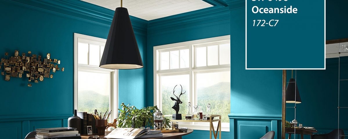
And so, one of the colors that Sherwin-Williams identified as their 2018 color of the year, is Oceanside.
And there are so many things can go with that, although that’s a deep, teal blue, it’s really rich in color.
You can heighten that, and make a really classy space, by incorporating either lighter shades, which will make it more of a brighter scene, or incorporating some of those blacks, and rich browns that we were talking about, if that’s kind of the look you’re going for, for your gentleman space.
I really believe that you can make that look sophisticated.
There’s so many photos out there that actually will maybe deter you from using the color, but again, like I said, if you use it appropriately, maybe on an accent wall, or what not, it can have a huge impact, and be really great.
I’m just focusing on the color for 2018, but again, I love using any color.
And it’s just knowing how to use the color correctly, and how to incorporate it in your space, that’s going to make the biggest difference.
So thanks for watching, and again, stay tuned for my blog upcoming, on the different finds that I have put together to create the modern man’s gentleman man-cave.
Thanks so much for watching. Take care.
Get my FREE ebook, “Interior Décor Tips For the Modern Man” at www.refiningdesign.ca