

Happy New Year! I love a fresh start, don’t you? Time to make new goals, set new plans in action and take a few (albeit calculated) risks.
The start of a new year is always a special time for an interior decorator.
Because it’s around the time when Pantone announces its new Colour of the Year!
Please tell me I’m not the only one who’s excited.
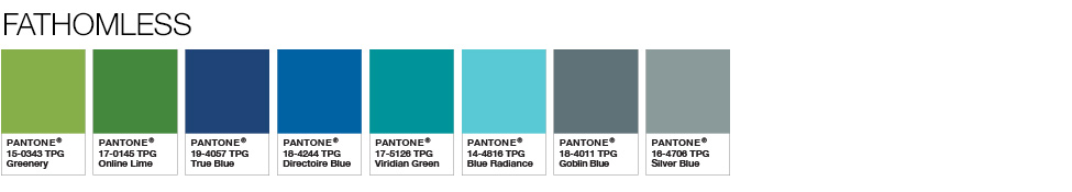
For 2017, Pantone selected Greenery as its Colour of the Year.
Not Green. Greenery.
It’s sort of a bright yellowy-green.
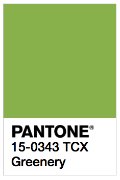
This bold and zesty shade symbolizes spring, new beginnings, freshness, and reconnection with nature.
Nevertheless, Pantone’s decision was met with some mixed reaction. Some critics called it too “Kermit.”
I for one, am a fan of Greenery, but I’m not completely surprised by some of the negative reactions.
It’s such a bold statement colour, I think a lot of people might initially have difficulty knowing how it can fit in with their daily decor.
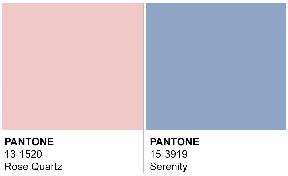
It certainly is a huge step away from Pantone’s choice last year. For 2016, Pantone actually broke with tradition and chose not one, but two Colours of the Year, Quartz and Serenity, and these were by far more moody and muted than Greenery.
But let’s face it, 2016 was a different time.
So last year 😉
In terms of interior decor, I think we should give Greenery a chance.
Greenery is a positive, lively burst of fresh year.
And considering what we have been through with 2016 with its bizarre and stressful socio-political climate and celebrity deaths, I say Greenery is the colour we all need in 2017.
And yes, you can make it work with your interior décor.
In fact, I think it’s pretty versatile.
Here are just a few reasons why Greenery, Pantone’s Colour of the Year, can easily make its way into your décor:
Pantone’s Colour of the Year is Gender Fluid
Greenery if gender fluid, meaning it’s not locked in as a typically “masculine” or “feminine” colour. Rather, it can be either one – or anything in between – depending on the context.
If you’re familiar with my work or my blog, you’ll already know that as an interior decorator, I don’t care much for the “feminine decor” or “masculine decor” labels anyway. I find them to be limiting and presumptuous. Maybe that’s one of the reasons I like Greenery so much. It breaks barriers.
Here’s what I mean about context…
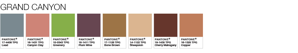
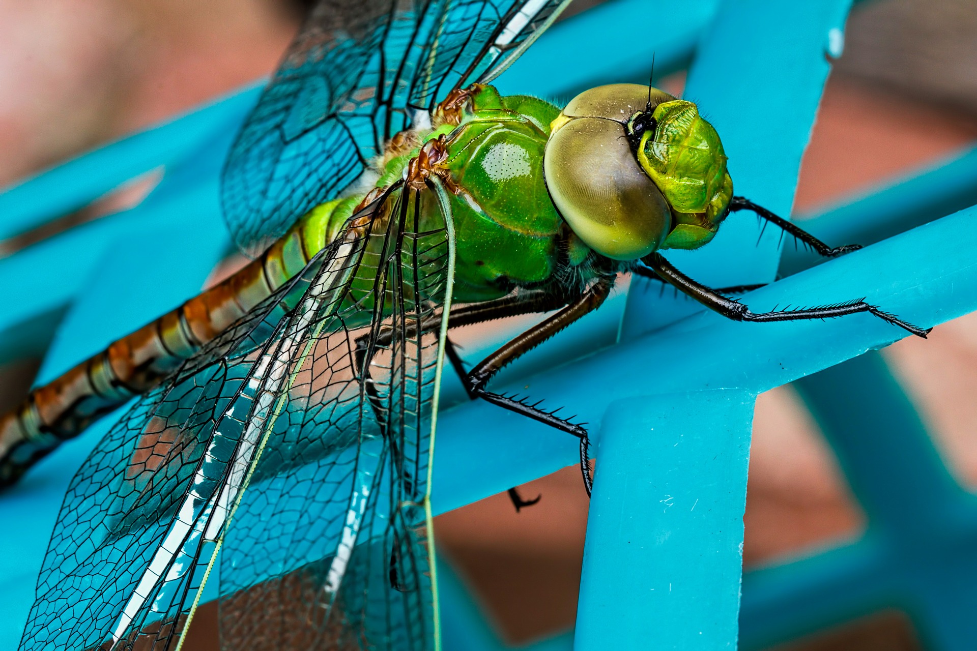
Look at this colour palette that incorporates Greenery. This might traditionally be considered a masculine colour scheme, but again I remind you that this palette would be amazing for anyone looking to make a bold, confident statement with their decor colour choices.
And yet here’s Greenery again, this time combined with softer, more muted shades (a so-called more feminine palette). It’s the same Greenery, in a different context, for a completely new effect.

And here we go, one more time. Greenery is seen in a completely different palette, which could be taken as masculine or feminine, whatever your taste may be! Don’t be restricted by labels!
Greenery combines beautifully with other colours
Greenery is the colour of nature, which means it pairs beautifully with other bold, natural shades.
I’d love to see Greenery tossed in as an accent colour in a blue a white room (an emerging trend), would you?
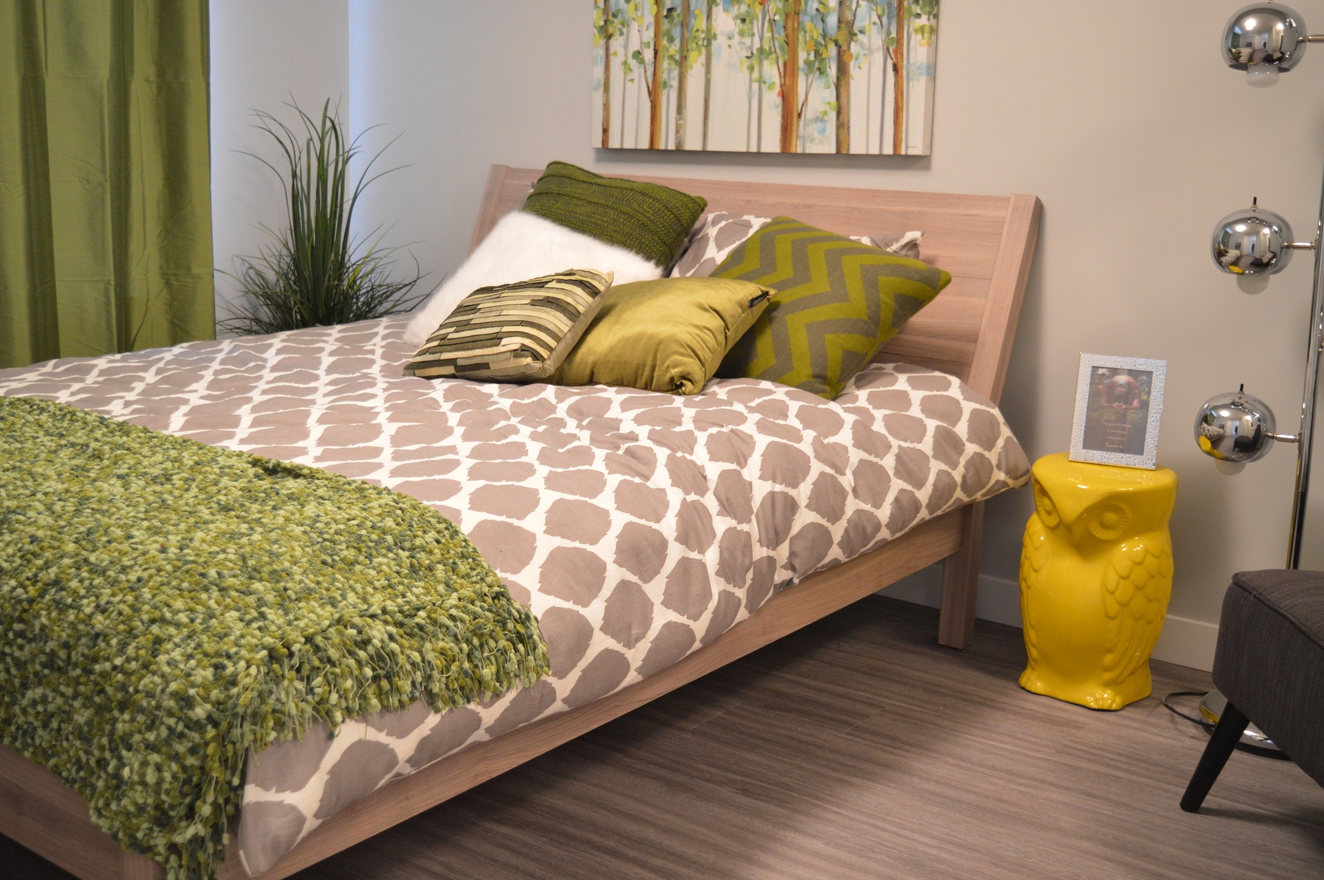
Greenery works in almost any room
Greenery isn’t just versatile working within different colour combinations, it’s versatile working in different rooms as well.
Fresh, crisp, and clean, I see Greenery working in spaces that intend to inspire creativity, conversation, and rejuvenation.
The first thing that came to mind when I saw this shade was how great it would be in a home office, where new ideas and game plans can flourish.
I can also see Greenery as an accent colour in a kitchen or dining room, sparking conversation and culinary brilliance.
Here’s a variation of Greenery in a dining room. Remember, you don’t have to drown an entire room in one colour – you can do very well by using Greenery simply as an accent, for instance on a feature wall.
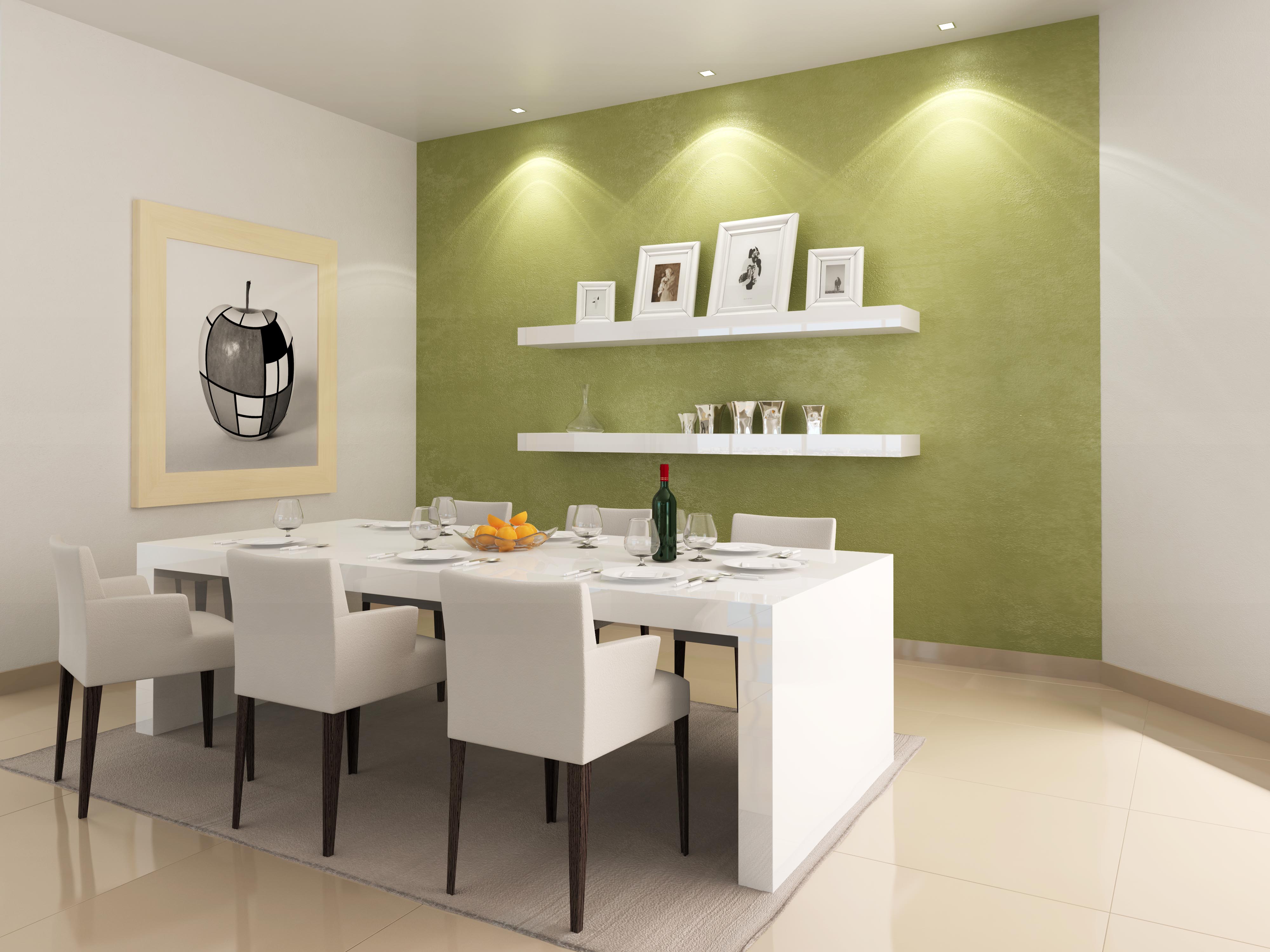
Image Credit: (cc) “dining room” by kobiz7 via Albumarium.com
And of course, what a zesty and refreshing colour for a bathroom or powder room – where one would retreat to re-energize.
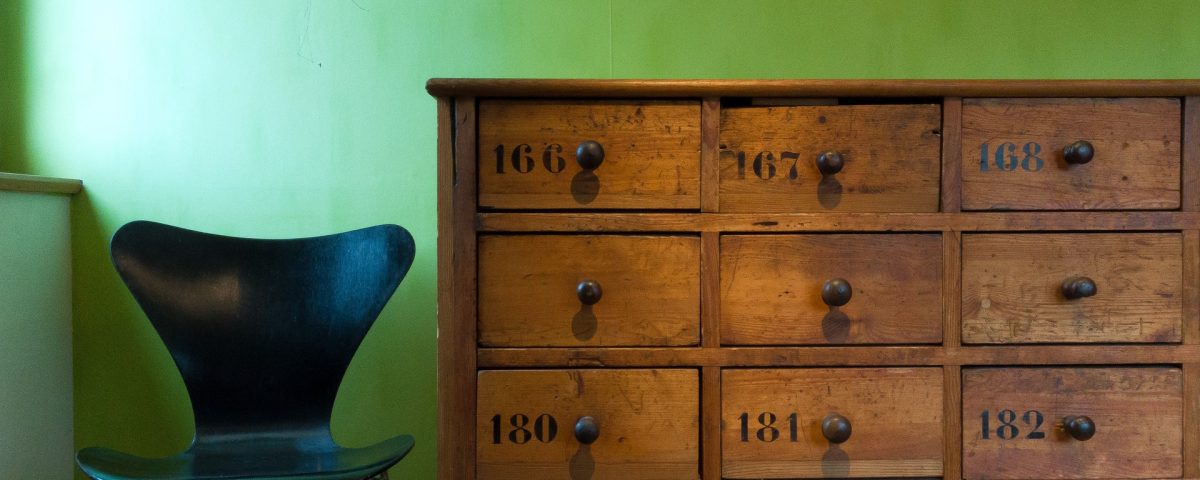
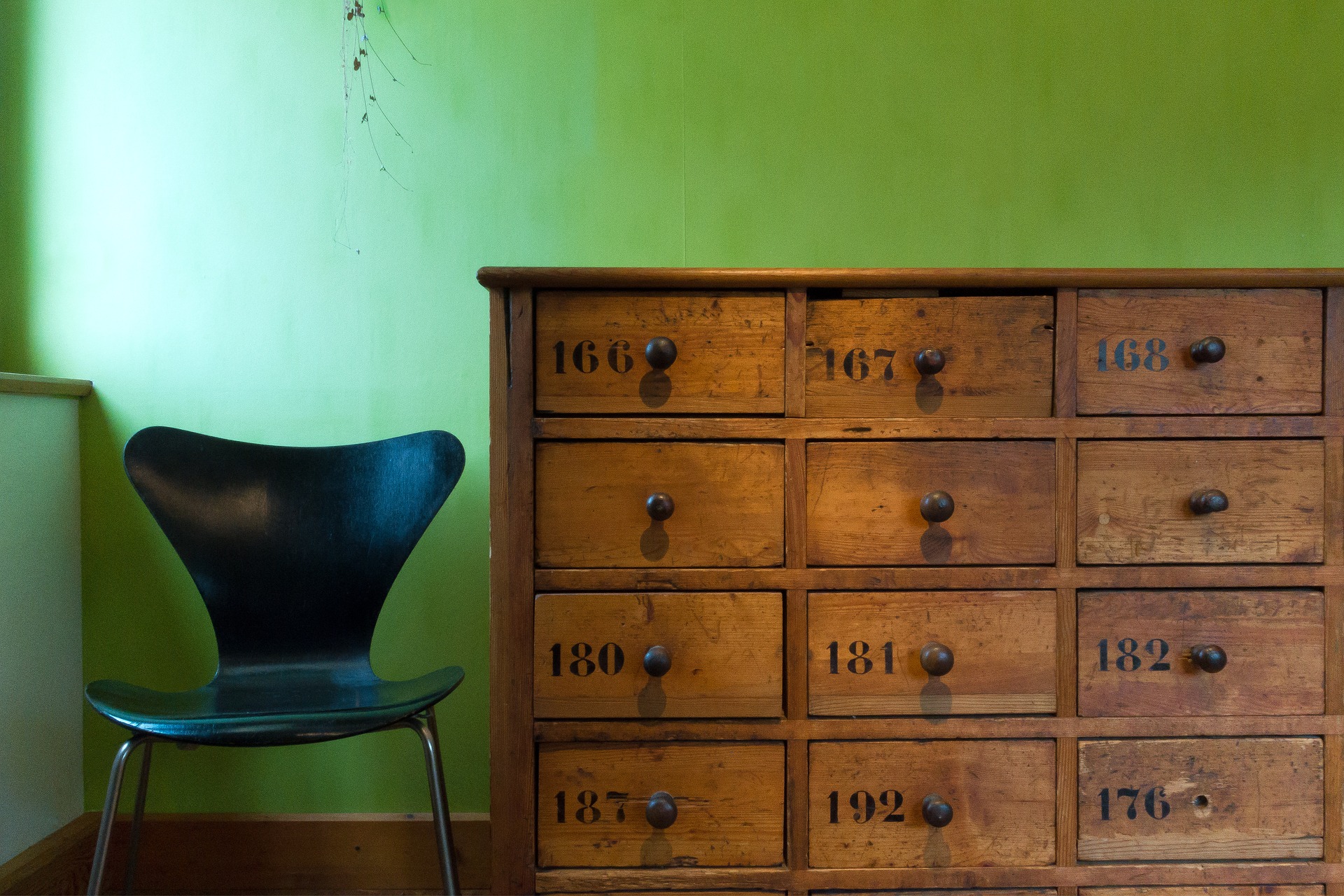
I also love how Greenery combines with other colours and textures (especially wood).
Greenery is shockingly simple to add to your decor
This colour could not be easier to add or incorporate into your decor.
Seriously – just add plants!
The very name, Greenery, practically commands that you do so.
Adding plants to your decor reaps many positive results.
Having living, breathing plant life in your home or workspace is not only aesthetically pleasing, it naturally connects you to nature.
If you can’t get out into nature as often as you’d like, why not bring nature inside to you, right?
As an added bonus, there are several health benefits to sharing your space with plants.
Plants breathe in carbon dioxide and breathe out oxygen (the opposite of what we humans do). By increasing the oxygen levels in our indoor space, plants literally help us breathe easier.
Not only that, but plants humidify or add moisture (water vapor) to an indoor atmosphere, which will help manage dry skin, colds, sore throats, and dry coughs.
Furthermore, plants are natural air purifiers, which means they help reduce toxins in the air and manage illness.
And if that wasn’t enough, it’s been proven that plants help improve focus. Who doesn’t want more focus?
Adding plants to your decor is inexpensive, easy, and healthy. So add some Greenery beauty by getting yourself a houseplant today!
What do you think of Pantone’s Colour of the Year? Tell me in a comment below!
Contact Kristy Malone at Refining Design today!
Tel. 416.735.3500
Email. kristy@refiningdesign.ca